THE CHALLENGE - GRADIENT BRAND
Amazon Music had just introduced gradients as the anchor of a new brand identity. My task was to create key art for Late Winter/Early Spring within that new visual language, while also solving a problem the rebrand had surfaced: the creative didn't feel connected to the actual in app experience.
My role covered the key art itself, visual guardrails, and templates for the production team and vendors. I also collaborated with the motion and copy teams on campaign positioning and ideating the motion approach.
THE SOLUTION: BRANDED MARRIAGE
The solution came from looking at the tension directly. The brand gradients were full color and bright. The app defaulted to dark mode, deep blacks with pops of color. So instead of choosing one or the other, I married them literally: gradient color over black. The same logic as album art sitting over the in-app canvas, just made intentional.
The solution came from looking at the tension directly. The brand gradients were full color and bright. The app defaulted to dark mode, deep blacks with pops of color. So instead of choosing one or the other, I married them literally: gradient color over black. The same logic as album art sitting over the in-app canvas, just made intentional.
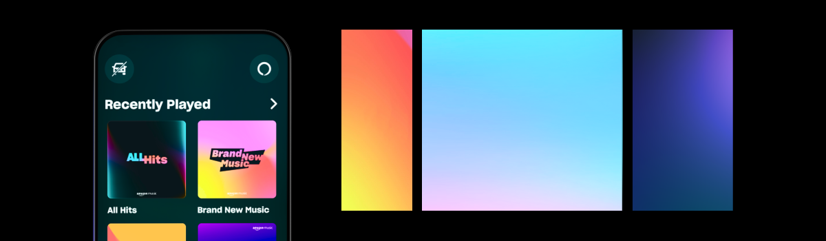
ABOVE: Final designs for key art gradients that will be used in dozens of placements ranging from store front (amazon.com) to different ad placements both owned and operated as well as outside channels (META, blogs, etc)
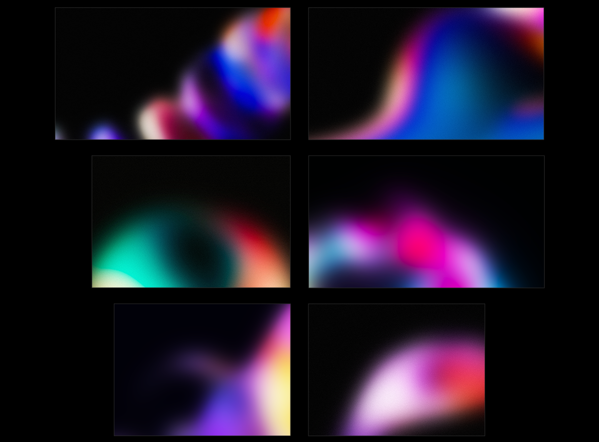
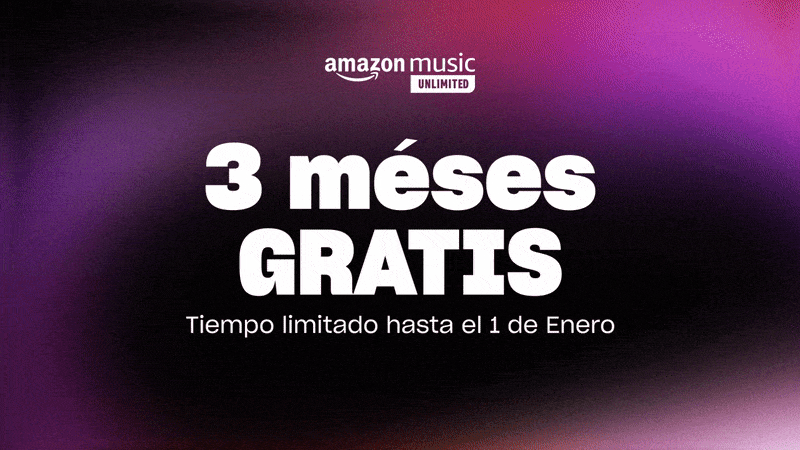
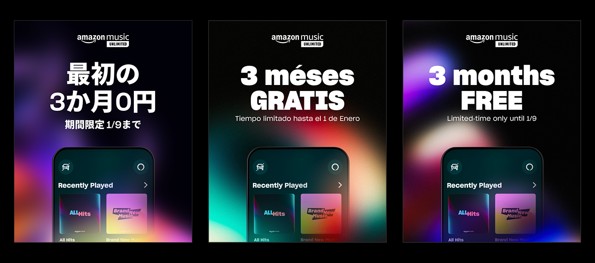
BELOW: Introduced an animated components via After Effects, working with the motion team, giving the gradients motion testing with copy from other markets outside of North America (15+ countries).
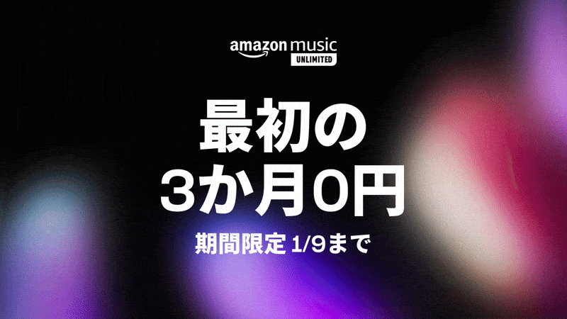
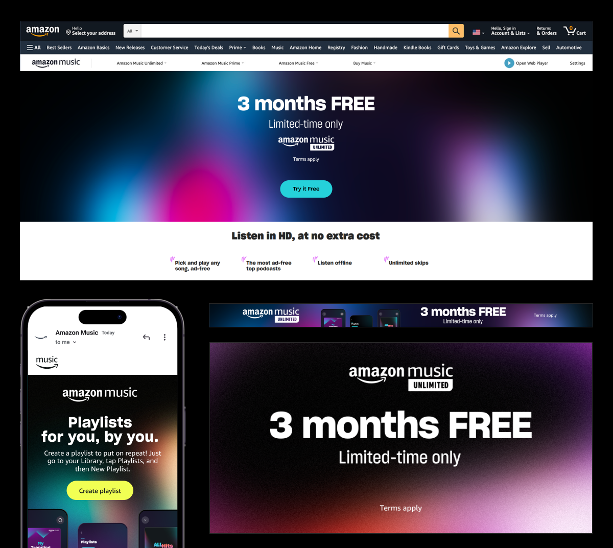
ABOVE: Examples of live creative in many different channels and markets. Takeaway was new, flexible key art used in most markets while also introducing a new toolkit and templates to the overall brand and design language.